Configuration View
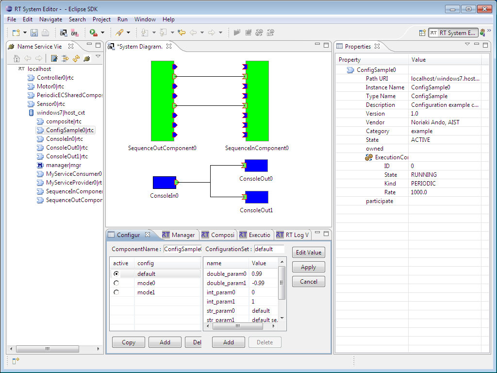
The Configuration View displays the configuration of the selected component, and allows it to be edited. The left lists available configuration sets, while the right displays the properties of the selected configuration set.
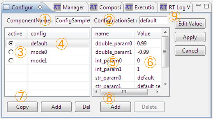
| No. | Description |
| ① | Name of the selected component. |
| ② | Name of the selected configuration set. |
| ③ | Displays the active configuration set, and allows it to be changed. |
| ④ | List of configuration sets. |
| ⑤ | Properties of the selected configuration set. |
| ⑥ | Property values of the selected configuration set. |
| ⑦ | Add/delete configuration set buttons. |
| ⑧ | Add/delete properties buttons. |
| ⑨ | Apply/cancel configuration changes. |
Changes made in the Configuration View will not take effect until the Apply button is pressed. Edited values are highlighted.
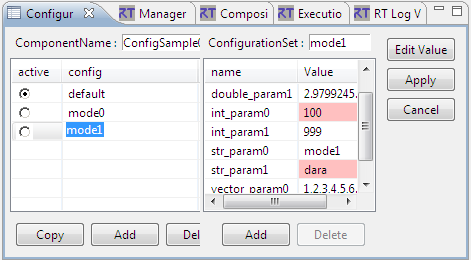
To edit a configuration value, click the Edit Value button to display the dialog below.
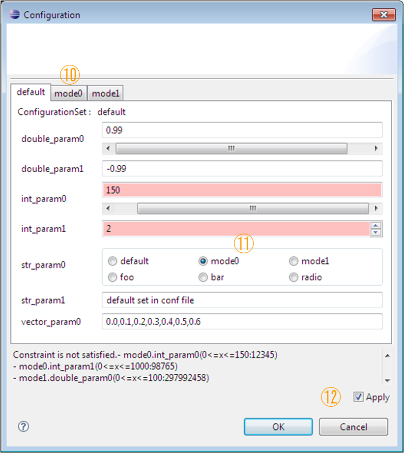
When there are multiple configuration sets, the tabs at the top of the dialog will allow the set currently being edited to be changed (10). Configuration parameters can specify an editing widget. When a widget is defined, the widget will be displayed for that parameter and the parameter can be edited using it (11). Widgets may be sliders, spin boxes or radio buttons. When no widget is specified, a text box is used as the default. Parameters may also have limits specified. When the widget type is a slider or spin box, these limits are required. When not specified in these cases, the widget will default to a text box. #br
| widget | image | Explanation |
| Slider | Select a value between the specified minimum and maximum values using a slider. Values can also be entered using a text box. | |
| Spinner | Select a value between the specified minimum and maximum values using a spin box. Fractional values are based on the specified minimum and maximum values. However, negative numbers cannot be specified. For example, if the maximum value is 10.00, the fractional part will be displayed to two decimal places. | |
| RadioButton | Select values using a radio button. | |
| TextBox | Standard text box entry. |
For those parameters that have limits specified, range checks will be performed. Parameters that fail the range check are highlighted in red in the dialog. When the OK button is pressed, an error dialog is displayed if there are any parameters that fail their range check.
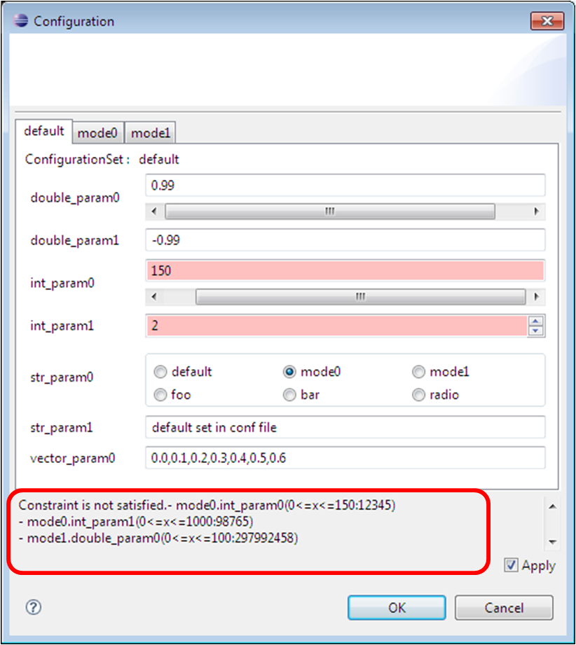
If the Apply checkbox (12) in the editing dialog is checked and the OK button is pressed, the changed configuration values are applied, as with pressing the Apply button in the main window (9).
The information displayed in the Configuration View is updated and cached when the selected RTC changes. Because of this, if the same RTC remains selected, differences between the displayed and actual information may appear. When applying changes to configuration parameters, the entire configuration will be overwritten, so care must be taken that old values do not overwrite new values. Also, the RTC specification allows for all sorts of property value types, but RT System Editor can only edit string-based values. When a property's value is not a string, it can be displayed but cannot be edited (except for clearing the value).